

NBS is a web-based enterprise software tool that the CDC develops and offers for free to state, local, and territorial public health departments to help them identify and track cases of disease over time. It is a key tool to help health departments make data-informed decisions to limit the severity and spread of disease, and is used to share data with the CDC for national tracking.
I led the USDS team which partnered with the CDC to help modernize NBS using taking an agile and human-centered design approach. In my role I worked on strategy, stakeholder management, and providing direction to teams, while occasionally diving into an individual contributor (IC) role. In this case study, I worked as an IC in order to help get our first modernization feature off the ground quickly.
We chose “search” as the first feature in NBS to modernize. We aimed to create a lightweight search tool that maximized user value while minimizing the level of effort needed to implement it. Our goals for Search 1.0 were
I started by performing a heuristic analysis on the legacy search, and found several high level issues that could be improved in a redesign

To understand user needs and pain points with search, I reviewed past user research done by my team as well as user requests documented in the legacy backlog. Some key takeaways from this included:
Lastly, I looked for inspiration, best practices, and lessons-learned from others who have designed advanced searches.

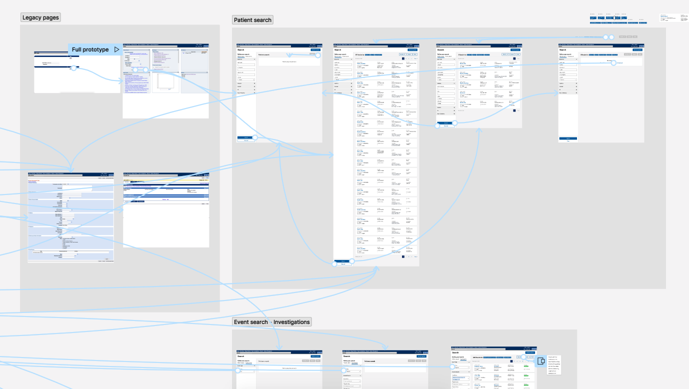
I used Figma to explore design concepts, eventually honing in on this version, which presents search filter inputs in a left bar and shows the results on the same page. A fellow designer helped to ensure all elements in the legacy search were represented in the new search, as well as refining the layout of the search results cards.
I reviewed designs with other designers for critique/feedback, and with engineers to check for feasibility. Lastly, I linked up the prototype so that it could be used for usability testing.
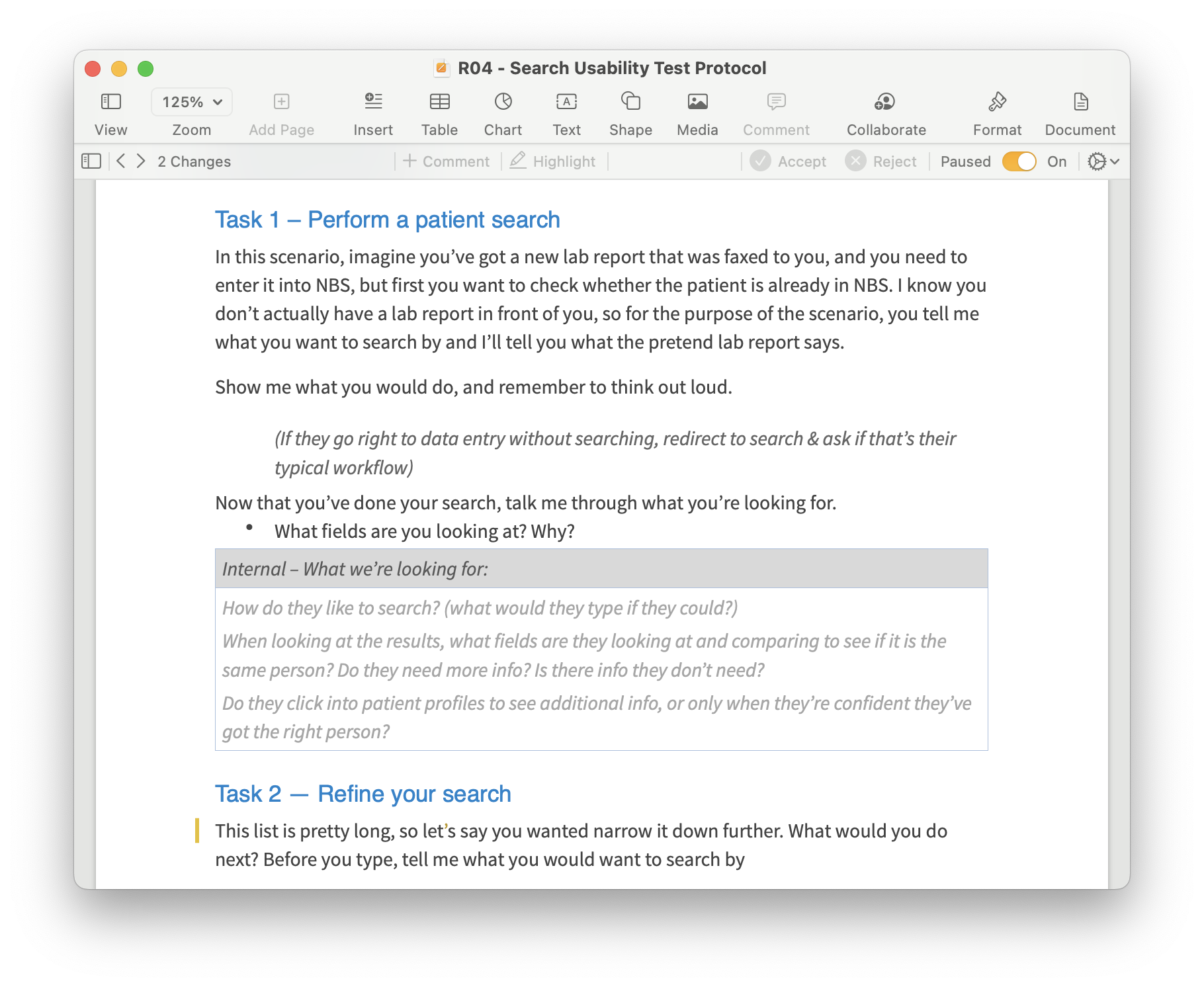
With the design ready, I created a test plan and script to evaluate the usability of the new search. The primary objectives of the testing were to assess whether users could easily navigate through the new search feature to accomplish their tasks, as well as to gain insights into user behavior, such as which fields they searched by, what information they examined in the search results, and what actions they wanted to take next.
I recruited 8 users from 5 different state health departments to participate in testing. Participants joined remotely via Zoom, and shared their screen as they used the prototype to complete a set of tasks. I moderated the sessions, describing each task to the participant, while a fellow designer took notes.
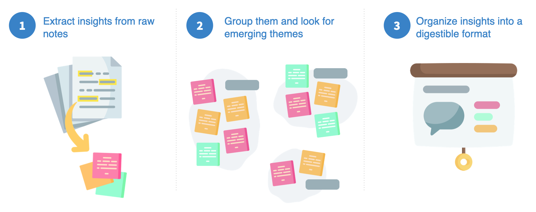
After tests were completed, I went back through all the notes documents, noting insights around user behavior and grouped them into common themes.
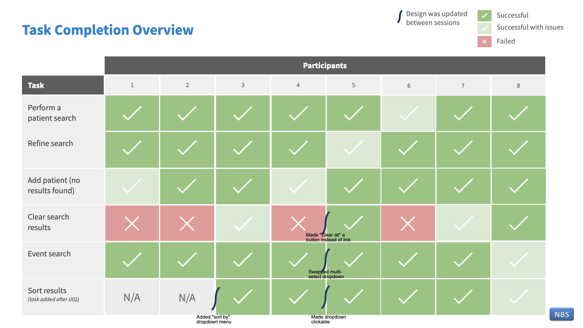
Overall the design tested very well. No participants failed any critical tasks, such as navigating and performing a search. However, we did observe several moments of hesitation or confusion that highlighted opportunities for improvements.
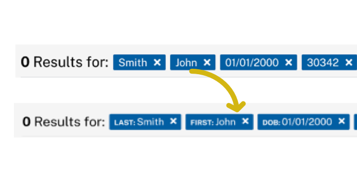
Some users thought the filter tags could get confusing, since you couldn’t tell what fields they related to.
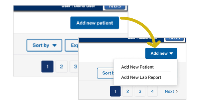
Updated the call to action to include additional options for things users indicated they are likely to do next.
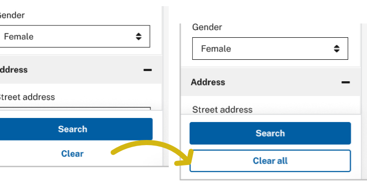
When asked how they would start a new search, most users failed to notice the “clear” button.
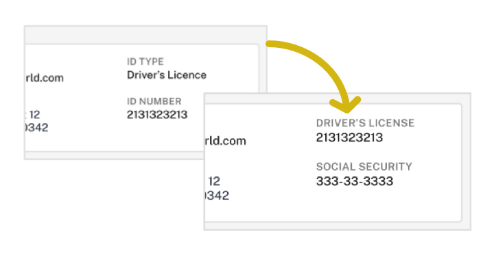
Several users did not initially understand that “ID type” and “ID number” were related.
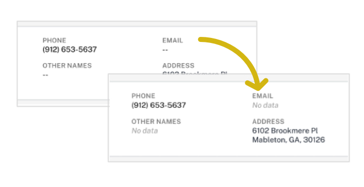
Some users were unsure what the “–” meant.
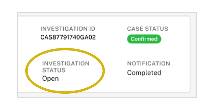
When doing a search for cases, users indicated it was important to know whether it was open or closed.